

State management in React can sometimes feel like wrestling a giant octopus, right? Well, not anymore! In this tutorial, we're diving into the world of Jotai, a remarkable and simple state management library for React.
We'll be building a shopping cart together, and along the way, we'll get to know Jotai's nifty features. No jargon, just practical knowledge. So, if you're tired of overcomplicated state management solutions, stick with us. By the end of this tutorial, you'll have a functional shopping cart and a new superpower in your React toolkit!
Let's jump right in and explore how Jotai can make your React life a whole lot simpler.
Step 1 - Install Next.js and build layout.tsx
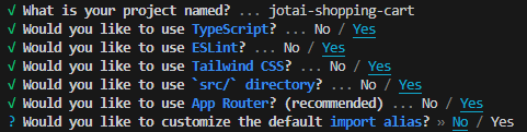
For this, we'll be using Next.js 13 and TypeScript. Naturally, the same applies for JavaScript, but why not take the chance to see some simple type safety?
npx create-next-app@latest
Navigate to './globals.css' and remove the clutter. You need to be left with just those three lines below.
@tailwind base;
@tailwind components;
@tailwind utilities;
Now go to page.tsx and clear that out too. Just put in an empty div for now.
The first component that we will need will be a navigation bar. Let's add that into our layout.tsx so that it is displayed in all our routes. We'll also need to adjust our html tag classes and add a main tag. This nicely ensures our main content always fills the remaining screen height.
layout.tsx
import "./globals.css";
import type { Metadata } from "next";
import { Inter } from "next/font/google";
import Providers from "@/components/Providers";

const inter = Inter({ subsets: ["latin"] });

export const metadata: Metadata = {
  title: "Jotai Shopping Cart Demo",
};

export default function RootLayout({
  children,
}: {
  children: React.ReactNode;
}) {
  return (
   <html
      lang="en"
      className="min-h-screen antialiased scroll-smooth scroll-p-16"
    >
      <body className={inter.className}>
        <Providers>
          <MainNavigation />
          <main className="flex-1 w-full flex flex-col overflow-x-hidden">
            {children}
          </main>
        </Providers>
      </body>
    </html>
  )
}
For using Jotai with Next.js, we will need to use a provider. Create a component for them with the 'use client' directive and wrap everything in the body of layout.tsx.
@/components/Providers.tsx
"use client";
import { Provider as JotaiProvider } from "jotai";
interface ProviderProps {
  children: React.ReactNode;
}

const Providers = ({ children }: ProviderProps) => {
  return <JotaiProvider>{children}</JotaiProvider>;
};

export default Providers;
Step 2 - Add the main navigation and mock cart
Of course in your layout.tsx file, you'll have an error right no as there is no MainNavigation component. Let's make one.
We will make the effort to put in a few links and a logo inside the MainNavigation component. This will also create a realistic layout and better equip us on deciding where to put our cart.
Make a file and folder inside the src directory.
@/components/MainNavigation.tsx
import Link from "next/link";

const MainNavigation = () => {
  return (
    <div className="flex px-4 items-center gap-4 max-w-7xl mx-auto">
      <p>My Store Logo</p>

      <nav className="flex ml-auto">
        <ul className="flex gap-2">
          <li>
            <Link href="">Home</Link>
          </li>
          <li>
            <Link href="">About</Link>
          </li>
          <li>
            <Link href="">Contact</Link>
          </li>
        </ul>
      </nav>
      <Cart />
    </div>
  );
};

export default MainNavigation;
Again, we still have an error as we have no cart component. We will create that quickly with radix-ui/shadcn and then we can import those components and have a look at where we are.
Creating the Cart Component
How to display the cart? If you search around the internet, you'll see a number of different cart flows. Many nowadays seem to take you to a new cart page, but personally I don't like it and for this demonstration we will create a simple popover. The user will click the cart icon and the cart will appear. For that, we will use Radix-UI's Popover component - shadcn flavour. I've never had a good experience with the shadcn CLI, so I always install it the manual way.
npm install @radix-ui/react-popover
Now create a new ui folder and add a file called Popover.tsx. Copy and paste the code from the shadcn site.
"use client"

import * as React from "react"
import * as PopoverPrimitive from "@radix-ui/react-popover"

import { cn } from "@/lib/utils"

const Popover = PopoverPrimitive.Root

const PopoverTrigger = PopoverPrimitive.Trigger

const PopoverContent = React.forwardRef<
  React.ElementRef<typeof PopoverPrimitive.Content>,
  React.ComponentPropsWithoutRef<typeof PopoverPrimitive.Content>
>(({ className, align = "end", sideOffset = 4, ...props }, ref) => (
  <PopoverPrimitive.Portal>
    <PopoverPrimitive.Content
      ref={ref}
      align={align}
      sideOffset={sideOffset}
      className={cn(
        "z-50 w-72 rounded-md border bg-white p-4 text-popover-foreground shadow-md outline-none data-[state=open]:animate-in data-[state=closed]:animate-out data-[state=closed]:fade-out-0 data-[state=open]:fade-in-0 data-[state=closed]:zoom-out-95 data-[state=open]:zoom-in-95 data-[side=bottom]:slide-in-from-top-2 data-[side=left]:slide-in-from-right-2 data-[side=right]:slide-in-from-left-2 data-[side=top]:slide-in-from-bottom-2",
        className
      )}
      {...props}
    />
  </PopoverPrimitive.Portal>
))
PopoverContent.displayName = PopoverPrimitive.Content.displayName

export { Popover, PopoverTrigger, PopoverContent }
I've made a couple of changes to the default shadcn code here by changing the align to 'end' rather than 'center'. This is to position our cart. Also, be sure to change bg-popover for bg-white in the PopoverPrimitive.Content tag. The rest of the colours provided won't work, but for our demonstration this is all we need to do to make it look OK.
You'll get an error here for the import cn. This is a simple function that merges and combines classes.
@/lib/utils.ts
import { type ClassValue, clsx } from "clsx"
import { twMerge } from "tailwind-merge"

export function cn(...inputs: ClassValue[]) {
  return twMerge(clsx(inputs))
}
npm install class-variance-authority tailwind-merge
Now that we are error free, we can go ahead and create our component and utilize the newly created Popover exports.
@/components/Cart.tsx
"use client";

import { Popover, PopoverContent, PopoverTrigger } from "./ui/Popover";

const Cart = () => {

  return (
    <div className="relative cursor-pointer">
      <Popover>
        <PopoverTrigger>
          <span className="px-4 text-base text-dark hover:text-primary dark:text-light cursor-pointer">
            <svg
              xmlns="http://www.w3.org/2000/svg"
              fill="none"
              viewBox="0 0 24 24"
              strokeWidth={1.5}
              stroke="currentColor"
              className="w-6 h-6 mr-4"
            >
              <path
                strokeLinecap="round"
                strokeLinejoin="round"
                d="M2.25 3h1.386c.51 0 .955.343 1.087.835l.383 1.437M7.5 14.25a3 3 0 00-3 3h15.75m-12.75-3h11.218c1.121-2.3 2.1-4.684 2.924-7.138a60.114 60.114 0 00-16.536-1.84M7.5 14.25L5.106 5.272M6 20.25a.75.75 0 11-1.5 0 .75.75 0 011.5 0zm12.75 0a.75.75 0 11-1.5 0 .75.75 0 011.5 0z"
              />
            </svg>
            <p className="absolute top-0 right-0">
              3
            </p>
          </span>
        </PopoverTrigger>
        <PopoverContent>
          Cart Content here
        </PopoverContent>
      </Popover>
    </div>
  );
};

export default Cart;
Go ahead and copy over the code above. I have taken an SVG from hero icons, which is also by radix-ui. If you are using one or two icons, it's easy enough to just copy the JSX directly from the site. Feel free to use any other icon, of course. Make sure to import Cart in MainNavigation now to that it is created.
Step 3 - Add products
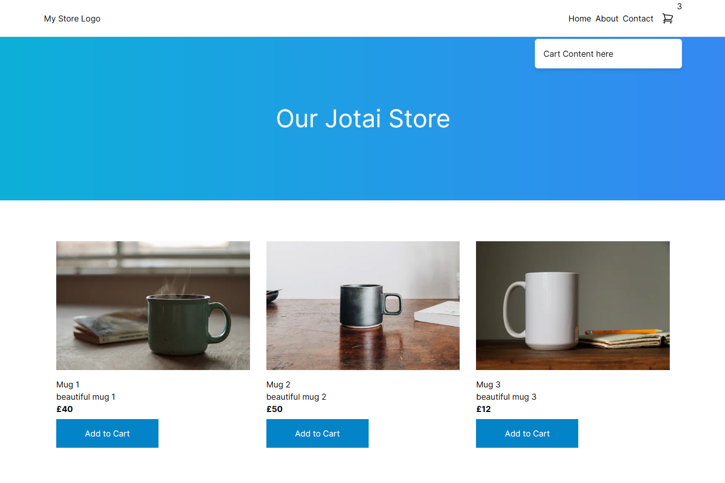
If we now run npm run dev, we should have a very plain navbar with a nice simple empty cart.

Let's mock out some products, so we have some content to work with. In a production environment, we would get this from a database and post cart content to an API, or with a server action, but for our demonstration of Jotai, we'll just use local data.
We'll be selling mugs. There's plenty of images we can use on Unsplash for our demo and there's plenty of mugs, so grab 3 images and add them to your public folder.
page.tsx
 const products = [
    {
      id: 1,
      title: "Mug 1",
      image: "/mug-1.jpg",
      description: "beautiful mug 1",
      quantity: 0,
      price: 40,
    },
    {
      id: 2,
      title: "Mug 2",
      image: "/mug-2.jpg",
      description: "beautiful mug 2",
      quantity: 0,
      price: 50,
    },
    {
      id: 3,
      title: "Mug 3",
      image: "/mug-3.jpg",
      description: "beautiful mug 3",
      quantity: 0,
      price: 12,
    },
  ];
Below that we can add a header with a simple title and background gradient.
Now we'll map over our products and return a ProductCard component for each product.
<>
  <header className="flex justify-center items-center w-full h-full min-h-[20rem] relative bg-gradient-to-r from-cyan-500 to-blue-500">
    <h1 className="text-5xl text-white">Our Jotai Store</h1>
  </header>
  <section className="max-w-7xl mx-auto px-10 py-20">
    <div className="grid grid-cols-3 gap-8">
      {products.map((product) => {
        return <ProductCard product={product} key={product.id} />;
      })}
    </div>
  </section>
</>
Now we are close to considering how to use Jotai. First, though, we need to display our products.
@/components/ProductCard.tsx
"use client";

import Image from "next/image";
import { Product } from "@/types/atoms";

const ProductCard = ({ product }: { product: Product }) => {
 return (
    <div>
      <Image src={product.image} alt={product.title} width={600} height={400} />
      <div className="pt-4">
        <h3>{product.title}</h3>
        <p>{product.description}</p>
        <p className="font-bold pb-2">£{product.price}</p>
      </div>
      <button className="bg-sky-600 px-14 py-4 text-white">
        Add to Cart
      </button>
    </div>
  );
};

export default ProductCard;
We will need to assign a type to the paramter product. We can create a type in a new types folder as we will need it elsewhere. Then let's import the type
@/types/atoms.ts
export type Product = {
  id: number;
  title: string;
  image: string;
  description: string;
  quantity: number;
  price: number;
};
Now go back to page.tsx and import the new ProductCard component.
Free of errors once again, let's take a look at what we have now.
Step 4 - Add products to our Cart
So how should we add products to the cart? We need to manage state here, of course. We'll need to track the current products in the cart, be able to add them, control quantity and also remove them. Importantly, we'll need to share this across multiple components and be able to change this state form multiple components. We could use prop drilling, but this isn't efficient and with many different functions to perform, it wouldn't make very clean code either.
As is obvious, this is where Jotai comes in. So how does Jotai differ from React Context and why are we not using that?
What is Jotai?
"Jotai is aiming for simplicity, minimalistic API and can do much more than useContext & useState.
...Build state by combining atoms and renders are automatically optimized based on atom dependency. This solves the extra re-render issue of React context, eliminates the need for memoization, and provides a similar developer experience to signals while maintaining a declarative programming model.
It scales from a simple useState replacement to an enterprise TypeScript application with complex requirements. Plus there are plenty of utilities and integrations to help you along the way!"
-- Jotai website
- Creating our first atom
Our first atom will be used to store the shopping cart products. The initial value will be an empty array. It will be of type Product array.
@/lib/atoms.ts
export const cartAtom = atom<Product[]>([]);
Now we need to install Jotai and import atom and Product.
npm install jotai
import { Product } from "@/types/atoms";
import { atom } from "jotai";

export const cartAtom = atom<Product[]>([]);
I think the next most logical thing to do is consider how to add products to this atom. Now to simply add our three products, we might just consider adding an onClick handler with some simple logic to push the product object to the cart array. However, you would then end up with duplicate entries and that wouldn't look very professional. What we need is to get our current state of the cartAtom and check if the product we are trying to add is in it. With Jotai, that is very simple with derived atoms.
export const addToCartAtom = atom(null, (get, set, update: Product) => {
  const cart = get(cartAtom);
});
The 'get' provides us with the atom value. Now we need to check if the product we are trying to add is already in the cart.
The 'set' allows us to set the new state.
The 'update' is any single value we receive for updating this atom. This is the argument we will pass from our 'add to cart' buttons later.
export const addToCartAtom = atom(null, (get, set, update: Product) => {
  const cart = get(cartAtom);
  const currentProduct = cart.find((product) => product.id === update.id);

  if (!currentProduct) {
    set(cartAtom, [...cart, update]);
  } else {
    set(
      cartAtom,
      cart.map((product) => {
        if (product.id === currentProduct.id) {
          return { ...product, quantity: product.quantity + update.quantity };
        }
        return product;
      })
    );
  }
});
Here we check if our product is already in the cart, if it isn't then simply add it, if it is, then we need to update the quantity only.
Now let's use this state on our 'add to cart' buttons.
We only want to set the atom value here, we don't need to read it here. For this, we can use useSetAtom. For components where we only need to read the atom, we use useAtomValue. When you need both, you use useAtom, however, this is less performant, so only use it if you need both.
@/components/ui/ProductCard.tsx
"use client";

import Image from "next/image";
import { Product } from "@/types/atoms";
import { addToCartAtom } from "@/lib/atoms";
import { useSetAtom } from "jotai";

const ProductCard = ({ product }: { product: Product }) => {
  const addToCart = useSetAtom(addToCartAtom);

  return (
    <div>
      <Image src={product.image} alt={product.title} width={600} height={400} />
      <div className="pt-4">
        <h3>{product.title}</h3>
        <p>{product.description}</p>
        <p className="font-bold pb-2">£{product.price}</p>
      </div>
      <button
        className="bg-green-700 px-14 py-4 text-white"
        onClick={() => addToCart({ ...product, quantity: 1 })}
      >
        Add to Cart
      </button>
    </div>
  );
};

export default ProductCard;
For our onClick handler, we need to provide it with an anonymous function that calls addToCart and provides it with our product object.
Now let's go and display them in our cart and see if it all works.
Create a CartContent component.
@/components/CartContent.tsx
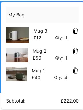
import { cartAtom } from "@/lib/atoms";
import { useAtomValue } from "jotai";
import Image from "next/image";
import TrashIcon from "./TrashIcon";

const CartContent = () => {
  const items = useAtomValue(cartAtom);

  return (
    <div>
      <h6 className="bg-[#fafafa] py-4 px-2 mb-4">My Bag</h6>
      {items.map((item) => (
        <div key={item.title} className="flex pb-4">
          <Image
            src={item.image}
            alt={item.title}
            width={60}
            height={40}
            className="w-[6rem] h-auto"
          />
          <div className="px-4">
            <p>{item.title}</p>
            <div className="flex items-center gap-2 ">
              <p>£{item.price}</p>
              <label className="text-sm ml-10">Qty:</label>
              <p>{item.quantity}</p>
            </div>
          </div>
          <button className="h-min ml-auto">
            <TrashIcon />
          </button>
        </div>
      ))}
    </div>
  );
};

export default CartContent;
Now we need to import this in the Cart component within our PopoverContent. Now that should work, let's see if it's working as expected.

Perfect. By pressing the 'add to cart' button multiple times, we can see that the quantity gets updated and all items arrive in the cart as expected. We can offer the user a way to handle quantity updates in the cart too, but for now this works.
Step 5 - Deleting items from the cart.
We create another derived atom. We can call it 'removeFromCartAtom' and once again we'll get the current cart value and then we can filter out the item we want removing.
@/lib/atoms.ts
export const removeFromCartAtom = atom(
  null,
  (get, set, update: Pick<Product, "id">) => {
    const cart = get(cartAtom);
    const updatedCart = cart.filter((item) => item.id !== update.id);
    set(cartAtom, updatedCart);
  }
);
We only need the id field, so we can Pick that from our TypeScript type. After filtering, we simply update the cart with the new array.
Let's get this working by adding an onClick function and setting the removeFromCartAtom.
@/components/CartContent.tsx
import { cartAtom, removeFromCartAtom } from "@/lib/atoms";
import { useAtomValue, useSetAtom } from "jotai";
import Image from "next/image";
import TrashIcon from "./TrashIcon";

const CartContent = () => {
  const items = useAtomValue(cartAtom);
  const removeFromCart = useSetAtom(removeFromCartAtom);

  return (
    <div>
      <h6 className="bg-[#fafafa] py-4 px-2 mb-4">My Bag</h6>
      {items.map((item) => (
        <div key={item.title} className="flex pb-4">
          <Image
            src={item.image}
            alt={item.title}
            width={60}
            height={40}
            className="w-[6rem] h-auto"
          />
          <div className="px-4">
            <p>{item.title}</p>
            <div className="flex items-center gap-2 ">
              <p>£{item.price}</p>
              <label className="text-sm ml-10">Qty:</label>
              <p>{item.quantity}</p>
            </div>
          </div>
          <button
            className="h-min ml-auto"
            onClick={() => removeFromCart({ id: item.id })}
          >
            <TrashIcon />
          </button>
        </div>
      ))}
    </div>
  );
};

export default CartContent;
Now you should successfully be able to remove products from your cart.
Step 6 - Get total price
For our penultimate atom, we will need to reduce the value of the products to one number. We'll use a read-only derived atom for that.
@/lib/atoms.ts
export const cartTotalAtom = atom((get) =>
  get(cartAtom)
    .reduce((total, prod) => total + prod.price * prod.quantity, 0)
    .toFixed(2)
);
We get the current value of the atom and by using the reduce method, we multiply each product quantity by each product price. Now in our CartContent component, we can display that. Add the following JSX above the closing fragment tags.
@/components/CartContent
const totalCartValue = useAtomValue(cartTotalAtom);

// just above the closing tags.
<div className="flex pt-10">
  <p>Subtotal:</p>
  <p className="ml-auto">£{totalCartValue}</p>
</div>
Your cart should now have a Subtotal displaying and changing when the cart updates.
Step 7 - Display cart total quantity in navigation menu.
This is very similar to the previous atom, so I'll just go ahead with supplying the code.
@/lib/atoms.ts
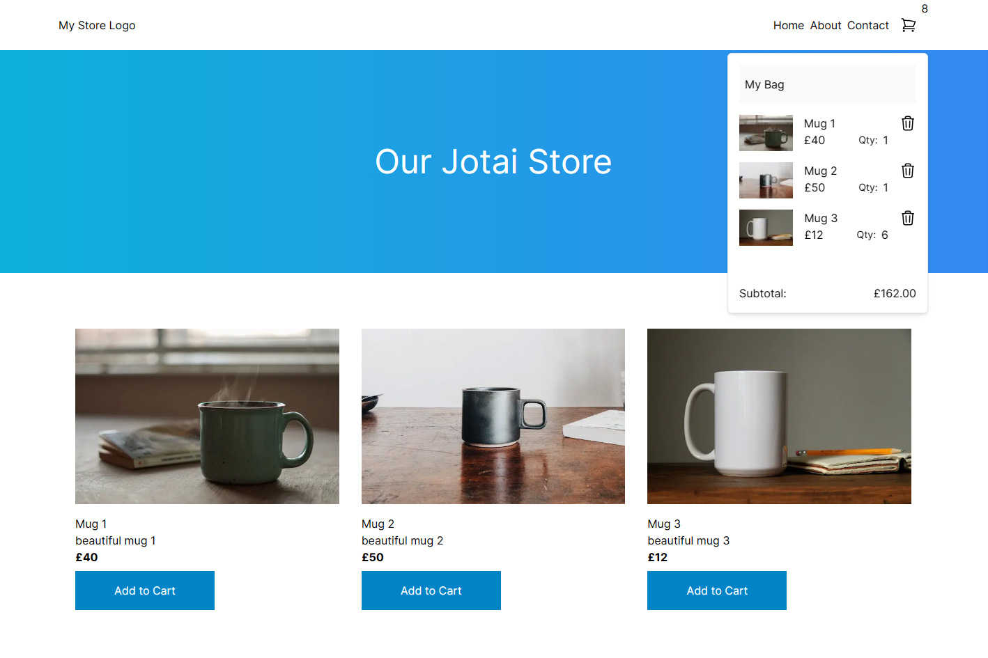
export const cartTotalQuantity= atom((get) =>
  get(cartAtom)
    .reduce((total, prod) => total + prod.quantity, 0)
    .toFixed(2)
);
Now we need to display it in place of the 3 we currently have. Obviously, we don't want to display a 0, so we can use a ternary operator.
@/components/Cart.tsx
import { useAtomValue } from "jotai";
import { cartTotalQuantity } from "@/lib/atoms";

const totalQty = parseInt(useAtomValue(cartTotalQuantity));

//old line
<p className="absolute top-0 right-0">3</p>

//new line
<p className="absolute top-0 right-0">
  {!totalQty ? "" : totalQty}
</p>
Let's take a look at the finished cart.
Summary
Jotai is a fantastic atomic state management library made by Daishi Kato that I've really enjoyed working with. There are many more features and optimizations that can be made using Jotai, such as async atoms, local storage atoms, and more.